Elegant & Contemporary Kitchen Renovation in Drummoyne
Meet Dani and Albert, parents to three active teenagers and owners of a Victorian-era home in the scenic, harbourfront suburb of Drummoyne. With a busy family and a love of entertaining, their kitchen had become the hub of daily life but, they confided, it wasn’t meeting their needs.
Rather than making their day-to-day routine easier, the kitchen design was a cause of daily frustration while the style was out of keeping with the original architecture of their home as well as their own taste. They invited us into their home, and not for the first time… In fact, we worked with them to reimagine their bathrooms, laundry and butler’s pantry renovation several years ago! Safe to say, helping them tackle their kitchen dilemma was an easy yes.
Before: Plain, Dated & Missing Utility
I’ll admit, at first glance, the kitchen presents as contemporary and functional so it was hard to see any major flaws. However, as the couple showed me their pain points, it became clear that their daily struggles were hiding in the details. Major frustrations were hiding behind the clean facade of cabinetry. Drawers weren’t soft-close, drawer runners did not fully extend, there was no in-cabinet bin solution, and the finger pull detail was too shallow for easy, comfortable operation.
These may seem like minor details, but they had become major issues for the family of 5 (plus 2 fur-kids) with a kitchen in constant use. For the family, who are all avid chefs and keen entertainers, high on their wishlist was a need for more durable materials, high-capacity appliances, and a streamlined flow into and through the space, which was impossible with the existing configuration.
As the project began, we took responsibility for the detailed design, specification of finishes, appliances, lighting and furniture as well as ensuring the design intent was honored throughout implementation. The result? A re-imagined kitchen balancing livable elegance with functional practicality — as perfect for their day-to-day lifestyle as it is for welcoming family and friends into their home. Come take a look…
A Highly Functional & Elegant Kitchen
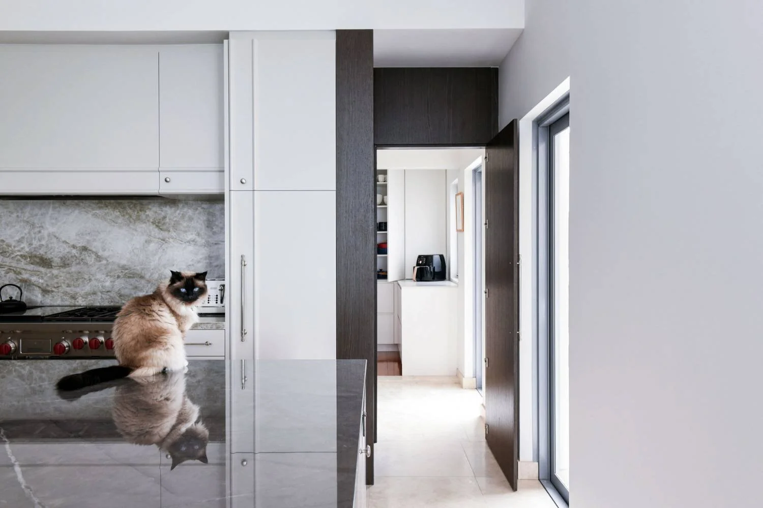
Despite maintaining the same footprint, this kitchen is a far cry from where it started! For example, while it may seem counterintuitive from a storage perspective, we shortened the island to allow for laundry and butler’s pantry access (on the far right) without the family or their guests having to traverse the cooking area. So much better!
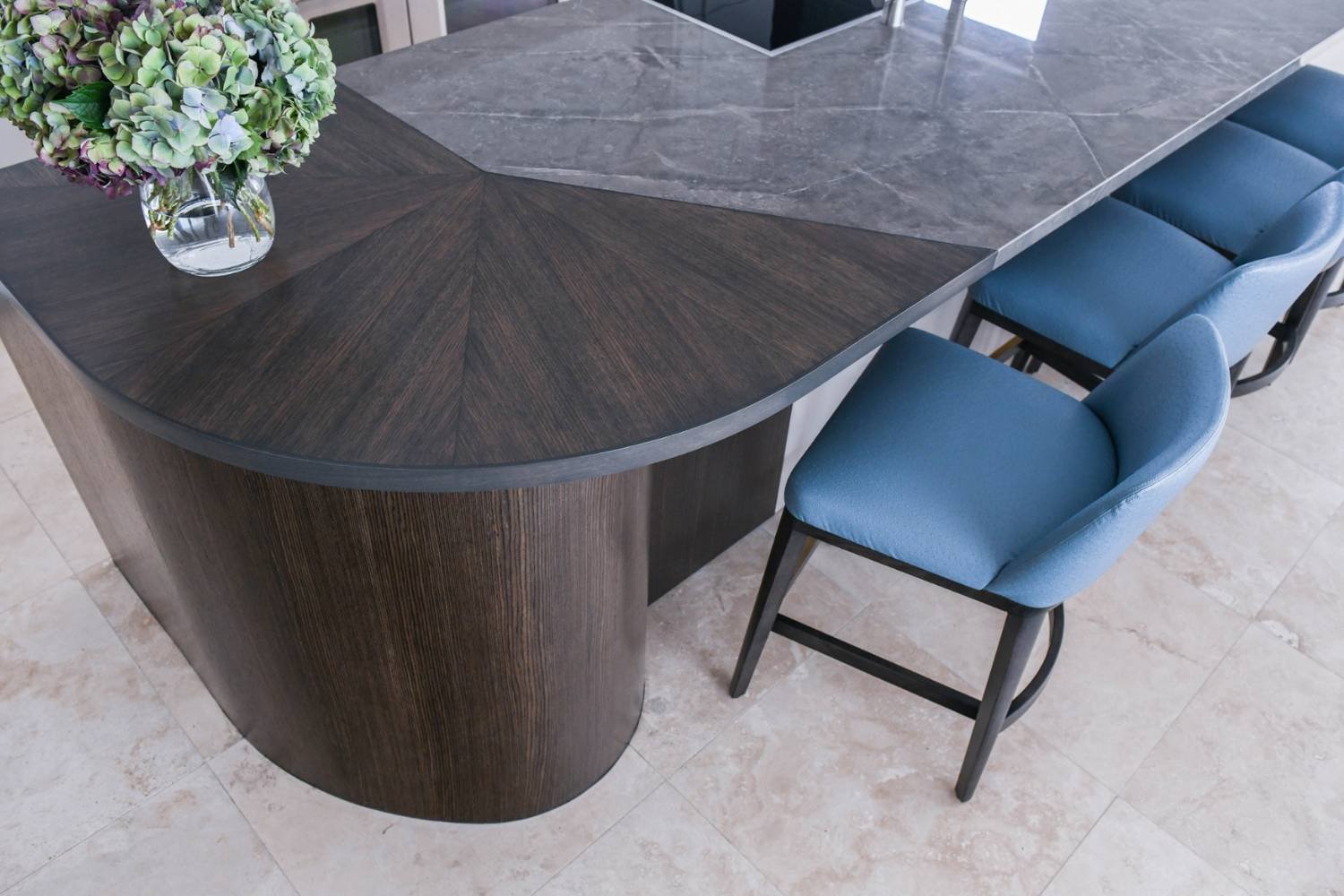
Although shorter than the original, this fabulous, custom island is not lacking in space. We increased its width to create storage on both sides of the island, while maintaining full-depth drawers and having space for TWO dishwashers! This island is now a hardworking member of the family.
And did you notice the unique, two-tone look? Gorgeous timber and stone meet for a one-of-a-kind radial detail, combining the best of form and function. The timber curve softens the linearity of the kitchen and gently guides the flow of daily traffic around the kitchen into the dining and lounge areas.
Without a doubt, this standout island was a labour of love for our talented cabinetmakers, but it was well worth the effort and is still one of my favourite elements of the kitchen.
We selected two variations of Dekton, a sintered stone, one for the island benchtop in a stormy grey and a second for the splashback in a lighter, warmer grey with stunning contrast veining. Not only is Dekton virtually indistinguishable from the real thing, but it also has the added benefit of being effortless to clean and maintain — checking durability off of Dani and Albert’s wishlist.
Meanwhile, these large, professional appliances from Wolf and Subzero are certain to come in handy when Albert and Dani entertain large groups, as well as for routine weeknight cooking. We paneled the refrigerator and kept other appliances hidden for a sleek, contemporary and high-end look. (Look at the hardware detail!)
While the kitchen is full of modern design features, we wanted it to blend seamlessly with the original areas of the home, as well. We created a custom moulding for the cabinetry, designed to reflect a detail we found on the original 1880s fireplace in the formal lounge. Design is all about harmony, and this kitchen achieves it and creates it for this lovely family.
For lighting, we opted for a linear pendant over the island. Have trouble seeing it? If so, that was our intention — we wanted it to visually disappear to allow the other design elements to shine! It provides light both up toward the ceiling and down onto the island, making it the perfect option for both task and ambient lighting.
The added brightness is also thanks to enclosure of the coffered ceiling (complete with blue LED lighting), which was positioned over the kitchen, living, and dining areas in the open floor plan. The family can now enjoy their beautiful, clean kitchen design without the distracting ceiling lines, shadows and disco lighitng.
Delighting in their Updated Kitchen
Dani, Albert, their kids and Puss, their beloved cat and our design muse, revel in their new kitchen! And, now that their daily frustrations are gone, the family can focus on enjoying time spent in their new space.
“The kitchen looks and ‘feels’ great. The finishes are beautiful and everything looks amazing. It has enjoyed its first Christmas season of entertaining and is working beautifully.”
Feeling inspired yourself? If a room renovation or whole-home renovation is on the horizon, we’d love to help make your new space look, feel, and function beautifully for you. Reach out to us here, and let’s begin the conversation. Until next time…
Live, beyond ordinary.
Donna


